Cover Art Fun
I have two independent/freelance cover artists I use for my books. And thankfully they get me.
My previous publisher had me fill out a two-page form that they would pass on to their artists. It would give them the basic idea of what I'd like my cover to look like. The publisher would then act as the go-between, and we were only allowed to have a couple of changes made to the original mock-up. I've heard some authors don't even get a say in their covers, and it can be frustrating when your cover looks nothing like your characters, or doesn't represent your story in any way.
That's the beauty of being able to hire your own artist. You contact them for availability and pricing, and then work directly with them, some do charge a minimal add-on fee for excessive changes, some don't charge anything at all and aim to please no matter how many changes you request. Luckily, I never have to make that many changes. In fact, most of my covers I love from the start. I think it's due to the information I give them in the beginning.

 I usually explain what my characters look like (hair, eye color, tattoos, build, height, or any other physical attributes I feel are important), and then I explain the "feel" of the story, or where the story takes place. I might also tell them of any important implements or items that are important to the story. Then I let their creative genius shine through.
When I get the first mock-up back I search online for the stock photo they use so I can see if it's an overused image, and I also like to see the transformation. That's the fun part for me! But I always have to sit back on pins and needles while waiting for the final product. Which sometimes can take a week or two depending on their schedules.


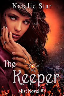
I've shared my most recent YA Paranormal covers made by Lourdes Blazek, and the original stock photos so you can see the transformation too. What do you think?
~Natalie
My previous publisher had me fill out a two-page form that they would pass on to their artists. It would give them the basic idea of what I'd like my cover to look like. The publisher would then act as the go-between, and we were only allowed to have a couple of changes made to the original mock-up. I've heard some authors don't even get a say in their covers, and it can be frustrating when your cover looks nothing like your characters, or doesn't represent your story in any way.
That's the beauty of being able to hire your own artist. You contact them for availability and pricing, and then work directly with them, some do charge a minimal add-on fee for excessive changes, some don't charge anything at all and aim to please no matter how many changes you request. Luckily, I never have to make that many changes. In fact, most of my covers I love from the start. I think it's due to the information I give them in the beginning.

 I usually explain what my characters look like (hair, eye color, tattoos, build, height, or any other physical attributes I feel are important), and then I explain the "feel" of the story, or where the story takes place. I might also tell them of any important implements or items that are important to the story. Then I let their creative genius shine through.
When I get the first mock-up back I search online for the stock photo they use so I can see if it's an overused image, and I also like to see the transformation. That's the fun part for me! But I always have to sit back on pins and needles while waiting for the final product. Which sometimes can take a week or two depending on their schedules.


I've shared my most recent YA Paranormal covers made by Lourdes Blazek, and the original stock photos so you can see the transformation too. What do you think?
~Natalie


Comments
Post a Comment